App Makeover #02 - Amazon
For this second episode of our “App Makeover” series, our design team chose to focus on one of the most important actors in the m-commerce sector, Amazon.
The latest market studies show that mobile accounts for up to 40% of global revenues of the major e-commerce actors. Therefore retention and user experience on mobile are key success factors, no matter what you are selling.
Facts
Despite a certain frugality, the iOS Amazon app appears to be one of the leaders of the e-commerce industry. At first sight, it presents a straightforward interface with its famous killer feature, one-click-purchase. Nevertheless, we think its global layout is still very “classic” and web-like.
Our global feeling is that the Amazon design team only adapted the web version to the smartphone screen. As a result, the omnipresence of text content (long sentences that do not properly fit in the interface) seems like a major drawback. Given Amazon has a lot of rich media (pictures, videos, ratings) this really seems like a missed opportunity.
Our position
From our understanding and expertise, key performance indicators on such apps are the global reactivity (e.g. time needed to access product details), the power of comparison tools and the overall experience smoothness. We will detail below enhancement opportunities on Home, Stores, Product details and Search sections.
We also leveraged the iOS 7 guidelines for a global UI lifting.
Findings
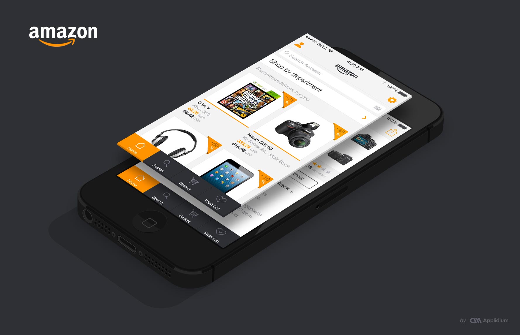
Home
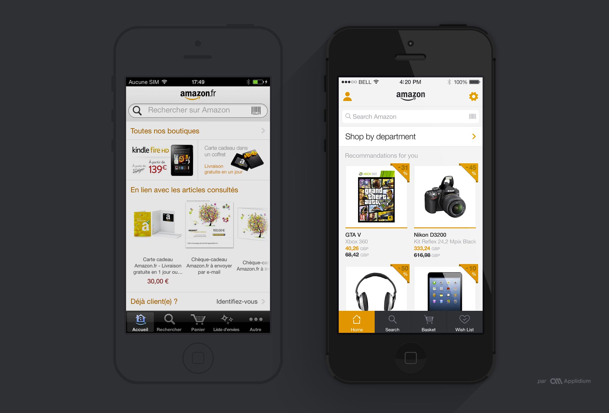
First, we decided to keep the tab bar which really facilitates the understanding of the navigation. To make the interface simpler we chose to use only four tab items, and we put other screens in the settings section.
Since logging in is not mandatory to browse the Home section, we put the login button in the navigation, therefore saving some important screen real estate. On top of that, this also provides us with a direct access to the “My account” section.
Moreover, we chose to put an emphasis on the Promotions area with a vertical scroll as customers are used to perform this gesture to load content.
Last but not least, we kept the search bar as a major element of the Home section.
Stores
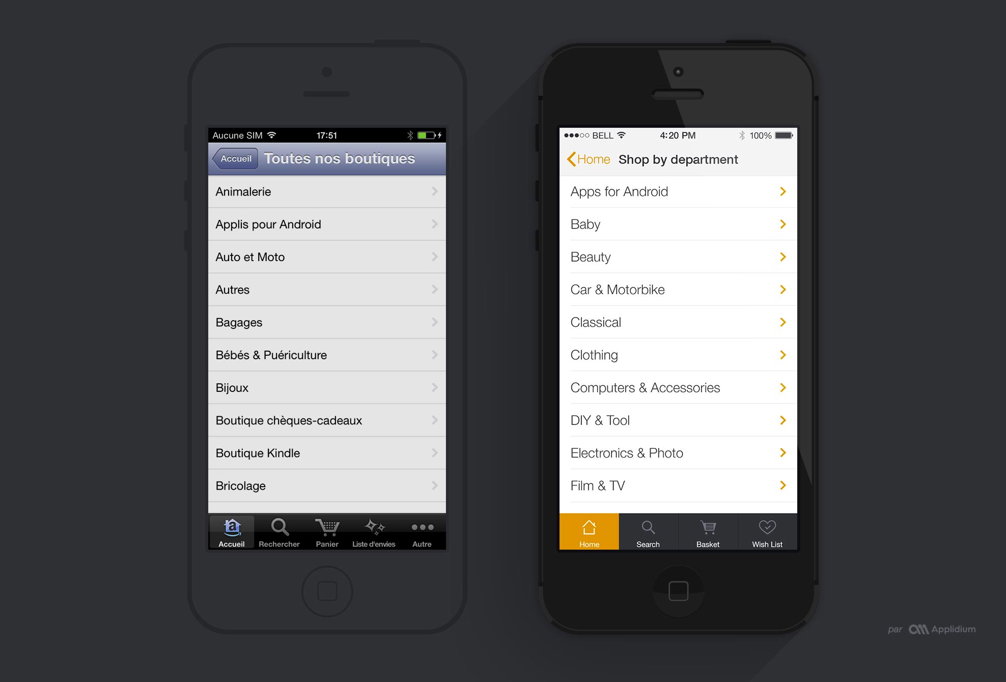
Stores can be also called Product categories. We just refreshed this sections following Apple’s recommendations for iOS 7.
Product Details
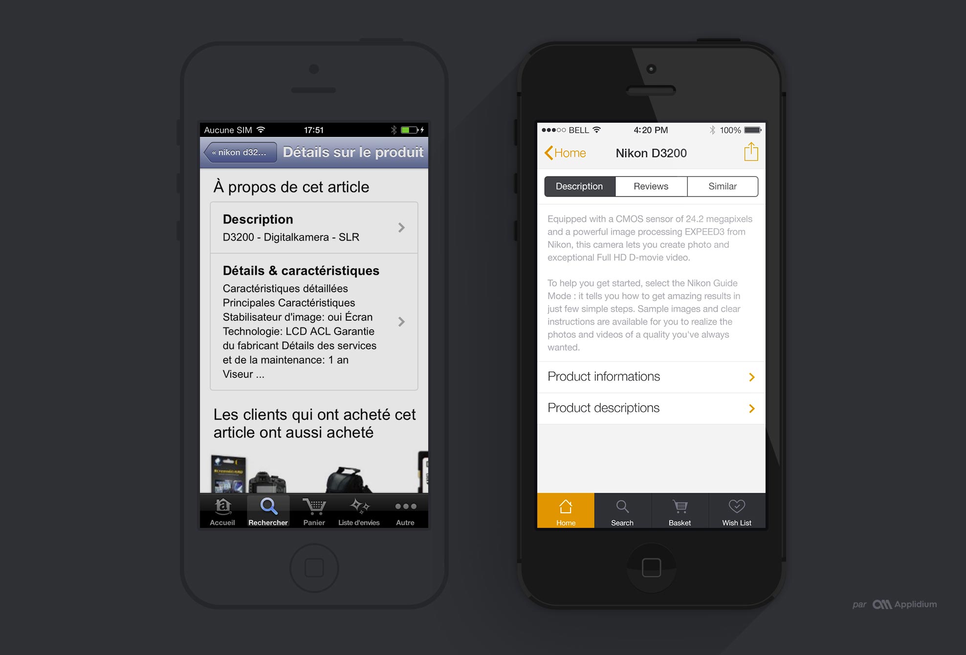
The Product Details was the most difficult part of our app redesign since the current version is way too web-alike from our standpoint. Therefore our intention was to put all the useful information at first sight, reducing the need for scrolling. By useful information, we mean price, discount, users’ ratings, sharing button, pictures and of course the “add to cart” button.
Others information were split into 3 tabs - Description, Users’ feedback, Similar Products - to avoid long distance scrolls. This tab menu remains present while scrolling for a quicker access to others sections.
Search
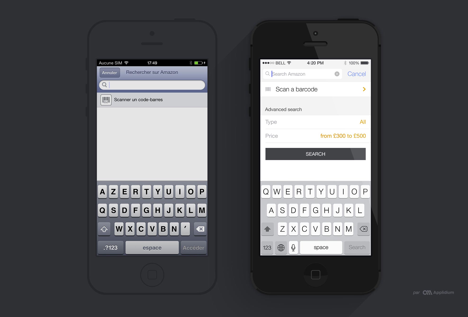
The original Amazon app initially leaves a large area blank on its search page. We saw this as an opportunity to offer more advanced search features (Categories and target price) in addition to the classical and simpler search menu. We thought it would be the most best solution to let the customer find exactly what he is looking for.
Conclusion
So here’s our take on redesigning the Amazon app. We hope you enjoyed it: feel free to give us your feedback on twitter.